@xkcdexplained The Big Caption

Toby, Dave & Ian Explain XKCD

There is a graph. On the X axis is sex, on the Y is computer.

October 6, 2010 at 1:18am
home
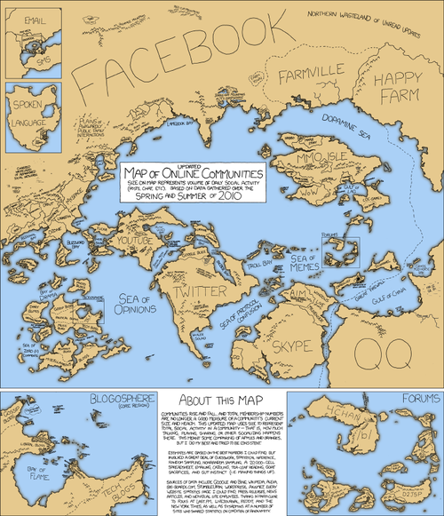
An updated version of the Map of Online Communities - a visualization of the size and relationships between various web communities. 
This otherwise useless data is visualized as a map for a good reason. It is meant to convince those that spend a majority of their lives online that the communities they belong to actually matter, like actual geographic locations. It is meant to give meaning to otherwise meaningless lives.

An updated version of the Map of Online Communities - a visualization of the size and relationships between various web communities. 

This otherwise useless data is visualized as a map for a good reason. It is meant to convince those that spend a majority of their lives online that the communities they belong to actually matter, like actual geographic locations. It is meant to give meaning to otherwise meaningless lives.

Notes

  1. deonsp reblogged this from kappachan
  2. kappachan reblogged this from xkcdexplained
  3. howithinkithappened reblogged this from xkcdexplained
  4. abrainonshuffle reblogged this from xkcdexplained
  5. mandaricks reblogged this from xkcdexplained
  6. eunoshin reblogged this from xkcdexplained and added:
    new one already? Truly, this...beautiful thing.
  7. dissonanced reblogged this from kirreiyy
  8. kirreiyy reblogged this from xkcdexplained
  9. xkcdexplained posted this